Selected work · 2022 → 2025
Exakom · Angular modernisation
Multi-year Angular migrations on the B2B product

Context
Exakom (opens in a new tab) builds B2B data-visualisation and monitoring products for industrial clients. My work spanned two engagements across nearly four years on the B2B product.
Freelance phase — migration & architecture
First engagement (2022): migrate a legacy Angular codebase to a modern stack and introduce DDD architecture to pay down structural debt.
- Full Angular upgrade with clearer module boundaries — domain-driven layers, feature isolation, and shared kernel.
- Refreshed component library foundations before the longer apprenticeship.
- Proposed Agile + CI practices and set up the testing baseline the team kept using.
Back-end — .NET Core, routes & OAuth
Fullstack delivery included the .NET Core API layer alongside the Angular front-end:
- Integrated REST routes wired to database persistence for product features.
- Set up OAuth authentication so client access and session flows were secure end-to-end.
- Kept API contracts aligned with the Angular front-end and DDD module boundaries.
Apprenticeship — design system to brand charter
Three-year alternance (2022 → 2025): the most visible structural work was translating Kendo UI for Angular into a unified design system aligned to Exakom's brand charter.
Brand & visual identity
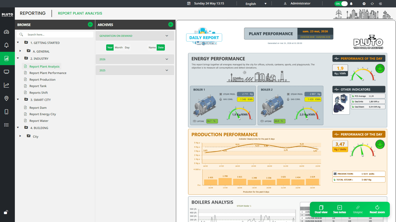
The charter was not a PDF on a shelf — it was encoded as Kendo theme tokens on the live B2B product (Pluto Analytics (opens in a new tab)). Every chart, grid, switch and toolbar consumed the same overrides so supervision screens stayed coherent from alarming consoles through million-point dashboards.
Typography
App chrome · Noto Sans 700
Crafted interfaces, delivered on time
UI body · Noto Sans 400
Building products that work well for the people who use them every day.
Navigation · Noto Sans 600
OVERVIEW · PROCESS · DELIVERY
Data · Noto Sans 500 · tabular nums
0123456789 · 1,234.56 · 0.00
Colour
#00B150
--kendo-color-primary
Exakom signature green — LIVE toggles, active nav, primary actions and on-state controls.
#343A40
Top app bar · vertical toolbar
Dark supervision chrome — global header, icon rail and operator framing.
#FAFAFA
--kendo-color-surface
Dashboard canvas and drawer backgrounds behind data cards.
#3D3D3D
--kendo-color-on-app-surface
Primary labels, KPI copy and drawer section titles.
#666666
--kendo-color-subtle
Secondary hints, prefix icons and de-emphasised metadata.
#03A9F4
--kendo-color-tertiary
Tertiary accent for links, info states and chart series differentiation.
Telemetry palette
#FF6358
--kendo-color-series-a
Analog traces and primary chart emphasis.
#4CD180
--kendo-color-series-c
Meter trends and positive consumption deltas.
#4B5FFA
--kendo-color-series-d
Boolean / state overlays and multi-series contrast.
#FFC000
--kendo-color-warning
Filter highlights and threshold callouts on filtered vs raw data.
#D32F2F
Stop controls · alarm salience
Hard-stop actions and alarm-critical operator controls.
#E81B6D
Secondary actions
Secondary toolbar actions — distinct from primary green without breaking the dark chrome.
Shape & density
- Radius
Kendo
mdrounding (.25rembase) on buttons, inputs and cards — industrial density, not consumer fluff. - Layout
Fixed dark chrome + collapsible drawer + full-bleed dashboard grid — built for 24/7 operator rooms and wall displays.
- Motion
LIVE / REPLAY state switches and loop-mode playback — motion reserved for operational state, not decoration.
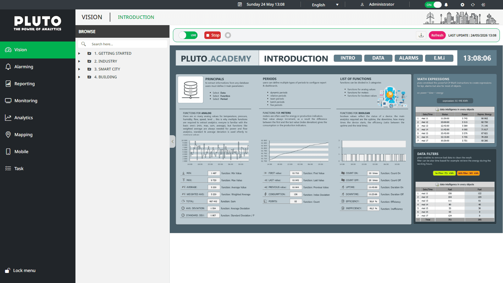
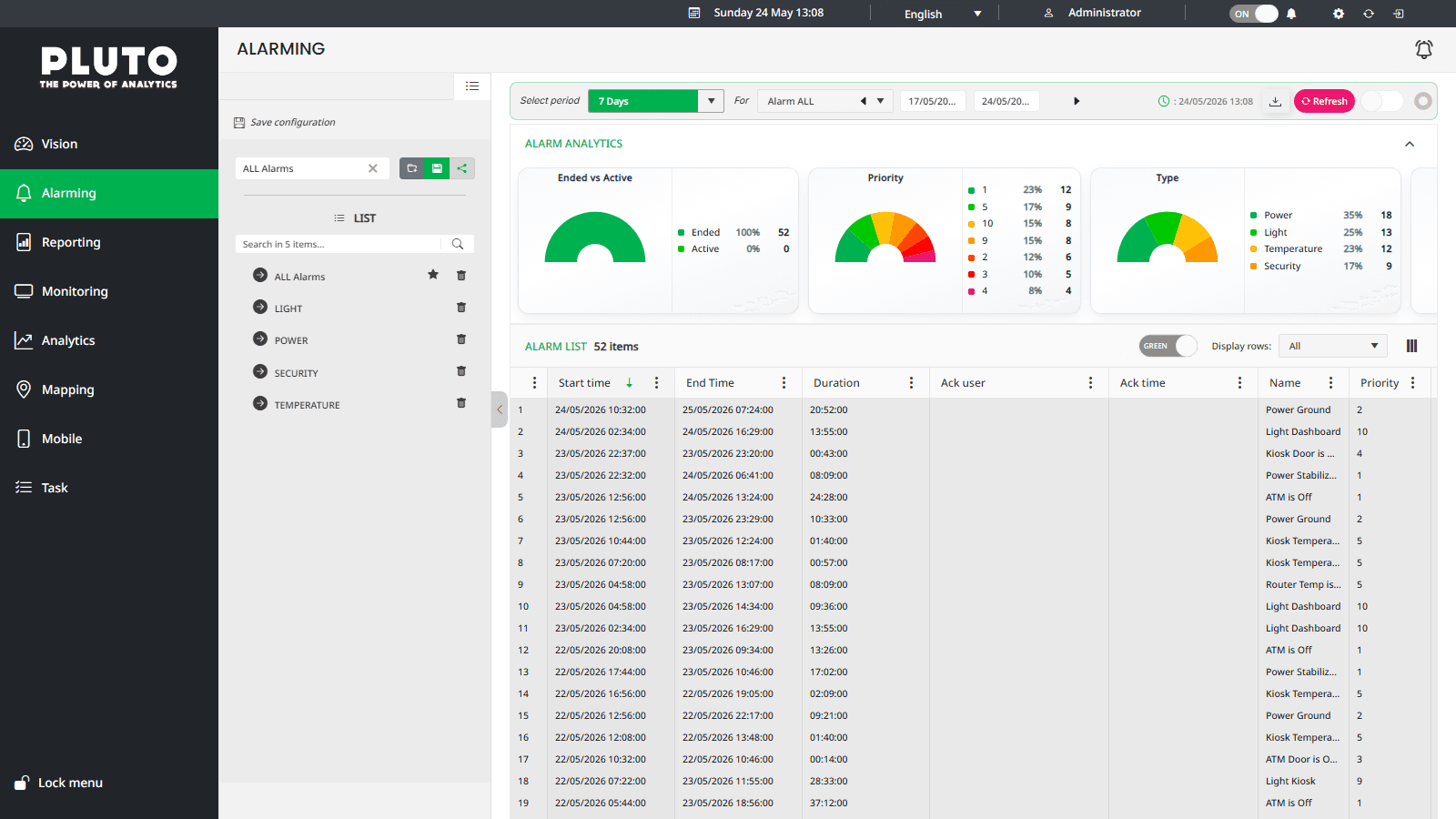
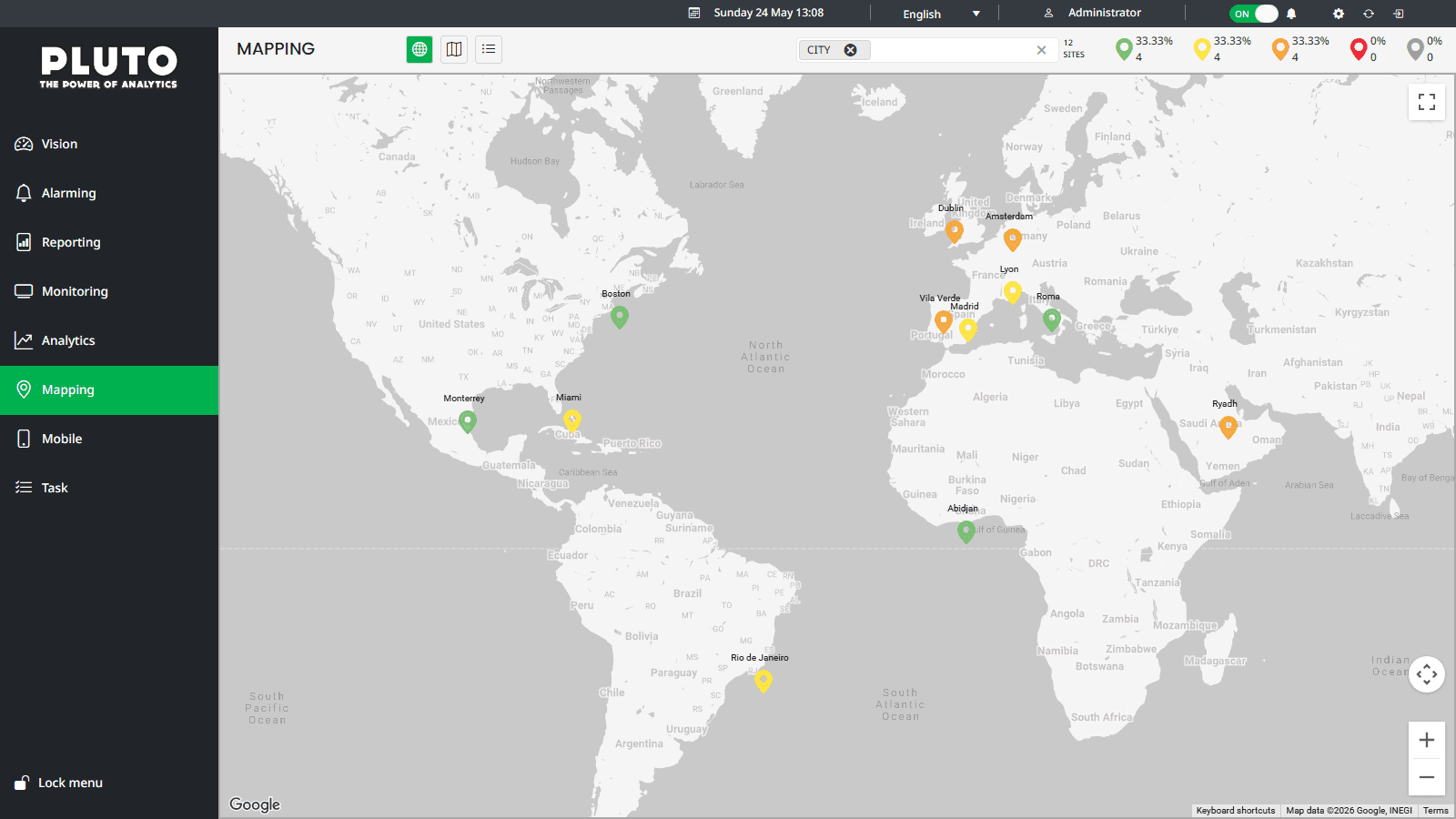
Kendo ships a vast, industrial component surface — it does not arrive ready-to-use at brand level. The work involved:
- Systematic token overrides for colour, typography, spacing and elevation — all derived from the company brand charter.
- Unified wrappers and directives so every chart, grid, dropdown and form control rendered with Exakom's visual language out of the box.
- Theme and variant coverage tested against accessibility contrast ratios.
- Direct collaboration with the Kendo UI team to identify and unblock hard edge cases — some token paths were undocumented or overridden at a CSS-specificity layer that required workaround strategies co-designed with the library team.
High-performance data visualisation
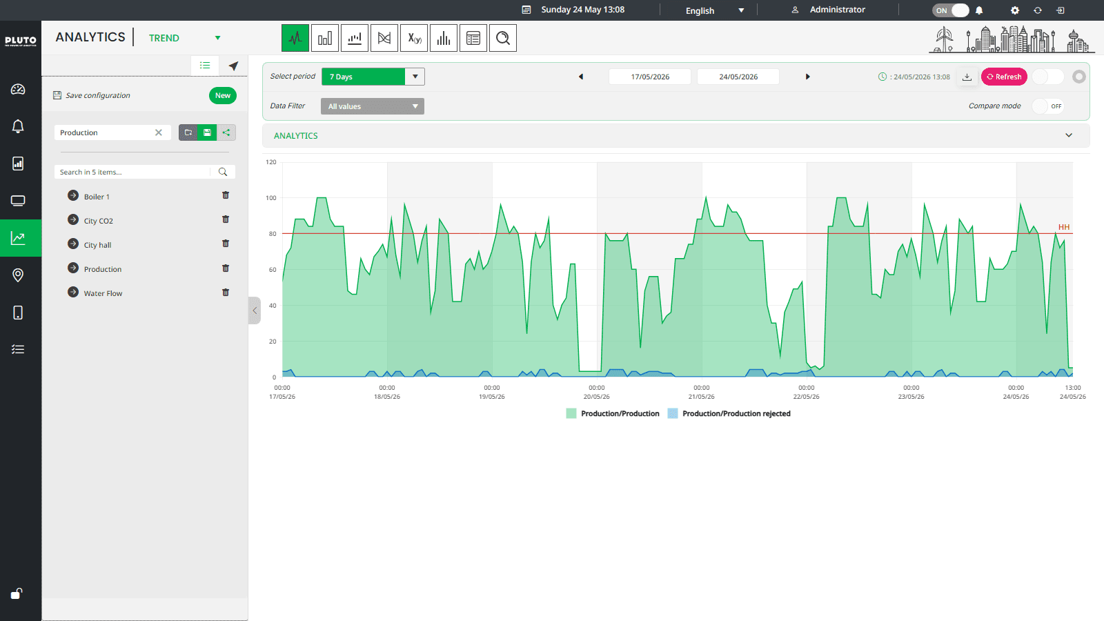
The product's core value proposition is displaying industrial telemetry at scale. That pressure became technical: visualising several million data points within one second.
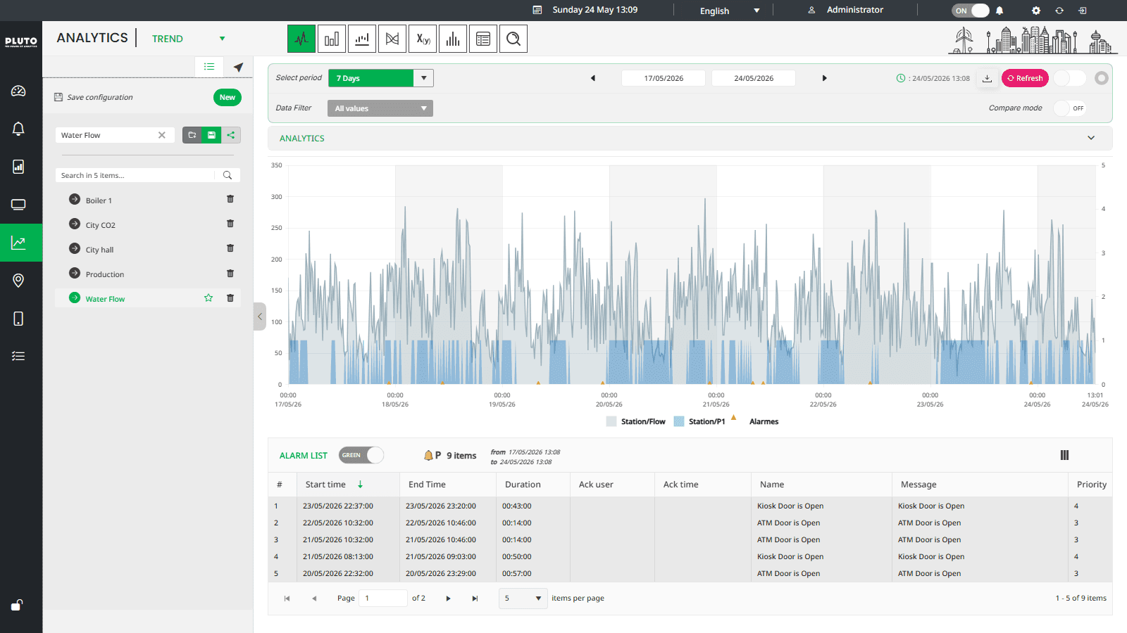
- Dataset optimisation
Designed data pipelines between the API and the chart layer — pre-aggregating server-side, streaming deltas via WebSocket, and batching client-side state updates so the render cycle never fell behind the data rate.
- Chart tuning
Profiled Kendo chart internals and identified rendering bottlenecks. Worked with the Kendo team to exploit lower-level rendering APIs and bypass default DOM-update paths that couldn't sustain the load.
- Interaction at scale
Zoom, pan and brush-select had to stay fluid over million-point series. Applied decimation strategies (LTTB), viewport-based lazy loading and GPU-accelerated canvas paths where SVG throughput hit its ceiling.
- Product design
Proposed interfaces in Figma in tight collaboration with the CEO and end clients — every visualisation feature validated in design before development.
- Maintainability
Documented features and patterns so rotations did not stall delivery.
SCADA / HMI — proof of concept
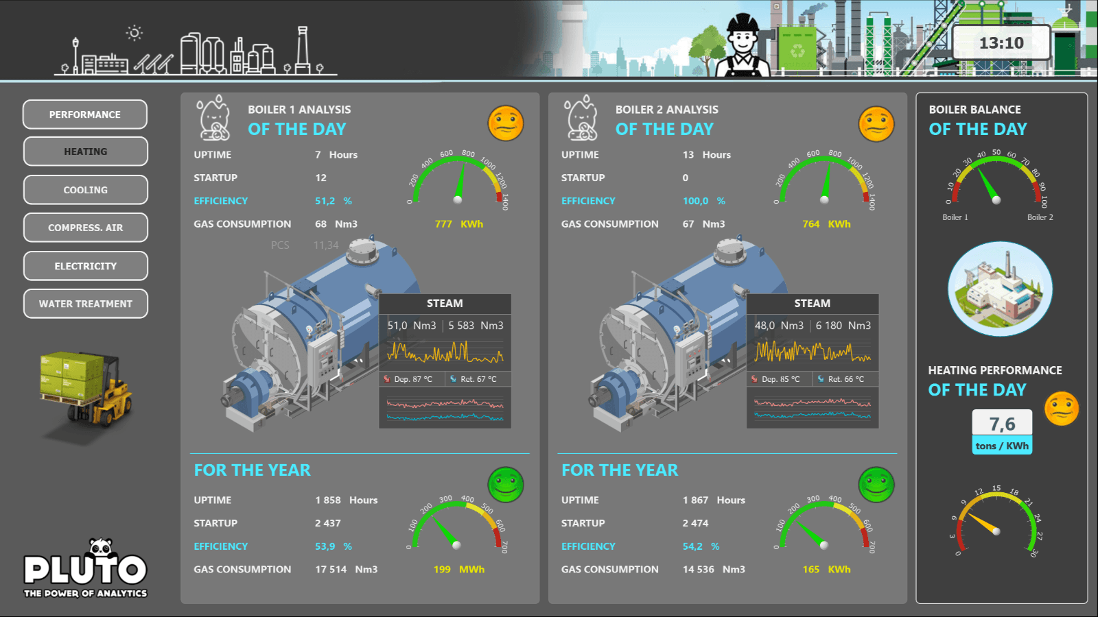
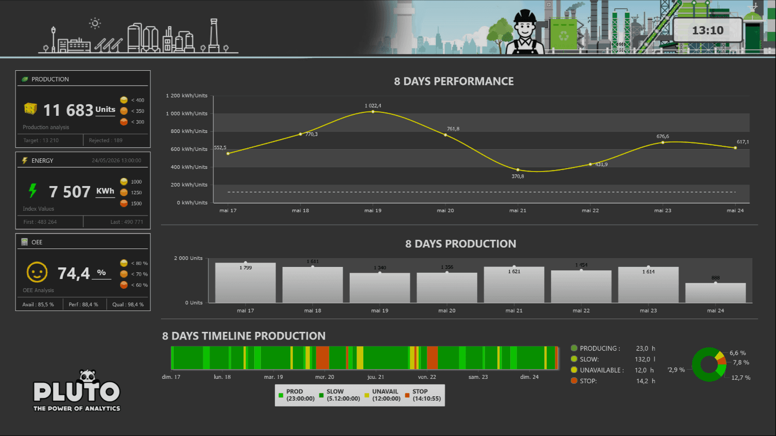
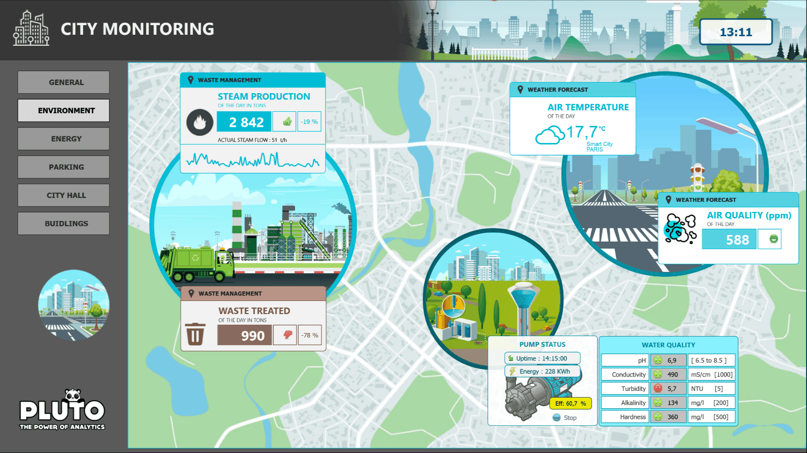
Toward the end of the apprenticeship I led a POC for a SCADA / HMI interface — an exploratory track intended to map Exakom's product roadmap into the server-data supervision market.
The POC explored:
- A web-based operator console with live process views — animated piping diagrams, equipment states and alarm feeds driven by live telemetry.
- Real-time page composition: widgets backed by live streams that reacted to state changes without full-page refreshes.
- Architecture fit-check against Exakom's back-end for HMI-grade latency budgets.
Industrial data marshaller
Exakom's platform needed to ingest data from heterogeneous industrial equipment — each running its own protocol. I contributed to the specification and front-end integration of a data marshaller that normalised incoming streams into a single application model, with live status and connection health surfaced in the supervision UI.
Stack & collaboration
Angular, C#, .NET Core, OAuth, RxJS, REST, WebSocket, Kendo UI, Figma — team grew from 2 to 4 with simplified Agile rituals.
Impact
Exakom's product surface became easier to extend: a secure .NET Core API with OAuth, fewer one-off components, predictable upgrade paths, and dashboards clients could read under real operational load. The million-point visualisation work unblocked a class of client requirements that had previously required custom workarounds. The SCADA/HMI POC and protocol marshaller opened a credible path into the server-data supervision market.
Fullstack engineer · Alternance + Freelance